Map Findings and Analysis
To view the maps, follow the link from the Overview tab.
The Caltrain mode share maps were constructed using U.S. Census data from 1990, 2000, and 2010, and American Community Survey data projecting from 2008 to 2012. The total number of commuters by mode for residents were available for each Census block group, and the total number of commuters by mode for employees were available for each Census tract. Using this data, weighted population numbers and mode share percentages were calculated for residents and employees who live and work within fixed radii of each Caltrain station. This information was tabulated and mapped using ArcGIS software.
There are several trends that the maps visualize quite well. The following charts focus on populations within 1/2 mile of each Caltrain station. This roughly corresponds to a five-minute walk, the industry standard for a comfortable walking distance.
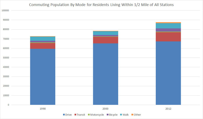
The above bar graph shows the total number of commutes per day for all residents living within 1/2 mile of Caltrain stations. Unsurprisingly, residents who drive to work comprise the largest mode, while those who take an alternative mode (transit, motorcycle, bicycle, walk, other) are in the minority. However, from 1990 to 2012, while the number of driving commutes increased by roughly 8,000 trips per day, the number of alternative mode commutes also increased by 8,000 trips per day. Thus, we can conclude that alternative transportation is gaining among residents who have access to Caltrain.
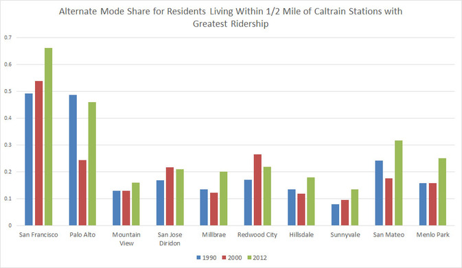
For the top ten Caltrain stations based on train ridership figures, the above chart was made to show changes in the alternate transportation mode share for residents. For most of the stations above, the percentage of commuters using an alternative mode of transportation spiked between 2000 and 2012. The mode shares for Palo Alto and San Mateo nearly doubled, and San Francisco, Millbrae, Hillsdale, and Menlo Park also enjoyed notable increases. This further corroborates the trends seen above: alternative transportation modes are becoming more popular for residents with access to Caltrain.
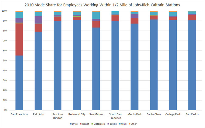
Finally, for the ten Caltrain stations with the most employees working within 1/2 mile of the station, a bar graph showing commuting habits for those workers was created. Upon comparison, the alternative mode share for employees working near Caltrain appears to be significantly below the levels seen for residents living nearby. Therefore, we conclude that policy to encourage alternative transportation use should include residents but focus on employees.
